BRANDING CONCEPTS
Commissioned & Personal Branding Concept Projects
Falls Academy

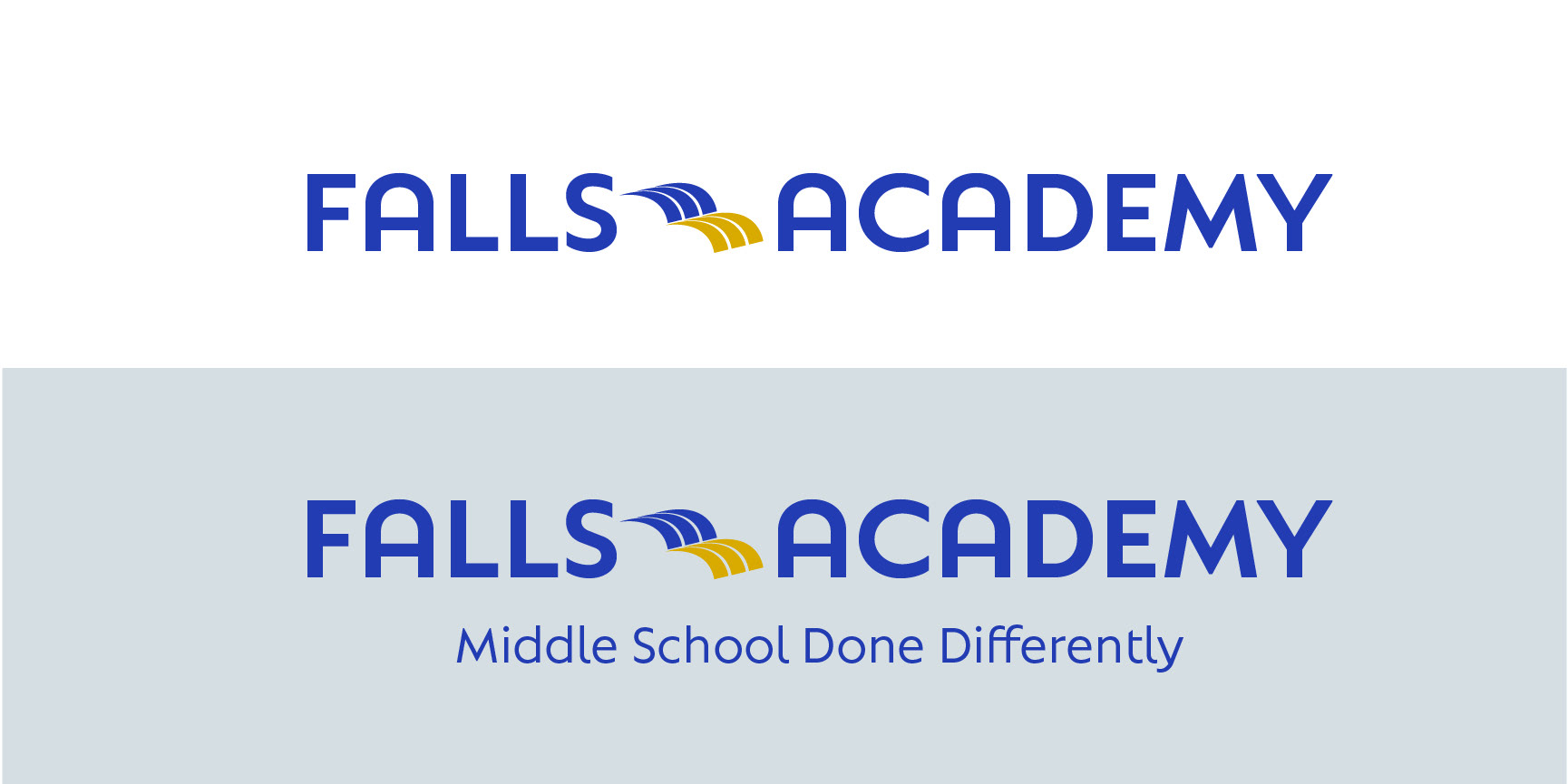
The client for this project reached out from Falls Academy looking for a new logo that would be used for branding purposes, including on letter heads, programs, posters, and t-shirts. The academy regularly and openly communicate with their student and program faculty to establish and maintain consistent social, emotional and academic expectations.
Taking inspiration from the current logo, and imagery used for the school, I began the process of creating my take on the 'falls'.
The symbol of the waterfall is what really tried to focus and work on when designing. I went through many different variations of what the waterfall would like like as a vector shape, while also attempting to incorporate it in a logo and word-mark.
The primary logo symbol touches on two important motifs: the symbol of a waterfall harkening back to the name of the academy, as well themes of freedom and flexibility. The logo is also meant to symbolize an open book, expressing themes of education, learning, and the powers of knowledge. The two colors demonstrate the turning of a different page, and what new knowledge can be ascertained when moving forward.
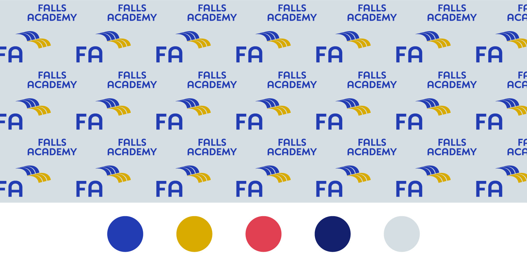
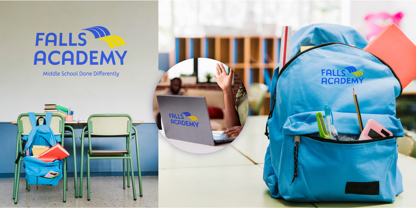
A pattern for backdrops and web design, as well as a color palette with a group of secondary accent colors rounds off the asset package.
______________________________________________________________________________
Debra Simon Art Consulting
For more than 30 years, Debra Simon of Debra Simon Art Consulting has designed and executed dynamic cultural programs for urban environments that promote core values, extend the brand identity of an organization, expand tenant amenity programs, cultivate customers and connect with local communities. Tasked by Debra to update her current logo, words and phrases such as 'community', 'placemaking', and 'urban space' guided my investigation.
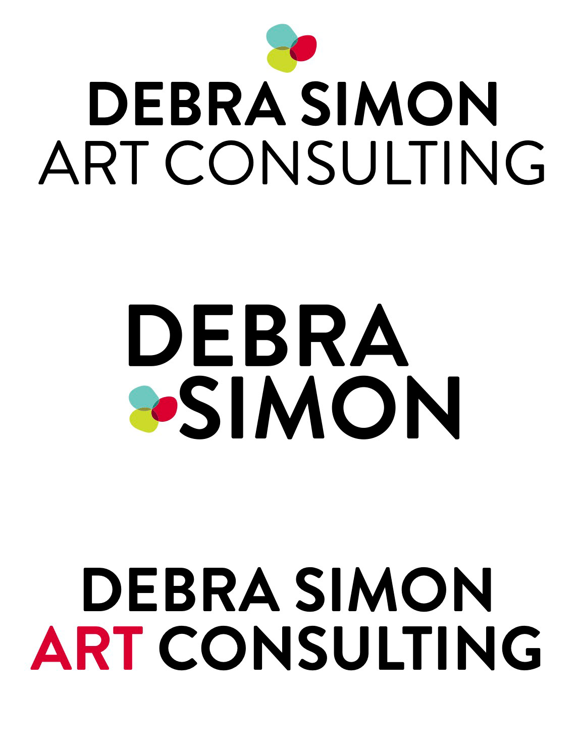
The old logo emphasizes the word 'art', which she wanted changed. The weight had to be put into Debra's name, clearly showcasing whose company this belonged to. Simon is very well known by who she is and how she communicates amongst her own clients and artists.


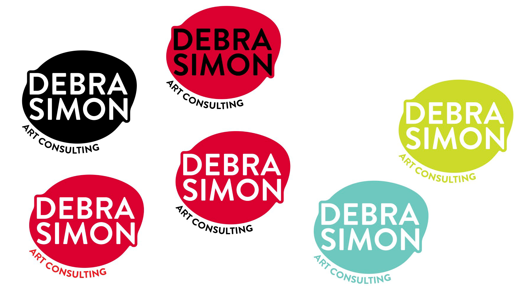
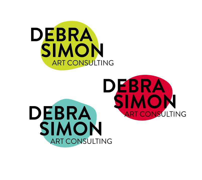
Theses initial concepts focused on Debra's name, while also incorporating playful elements. Public art is enjoyed and cherished by people in society, and I wanted to reflect that feeling of whimsy seeing paintings, statues, and sculptures in the public sector.
While Debra felt that we were heading in the right direction, she wanted to see something a little more clean and simple, but was able to convey a sense of movement, as she is always on the go, moving onto the next project.
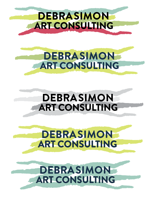
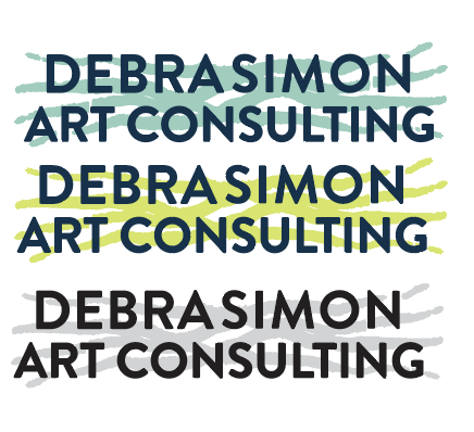
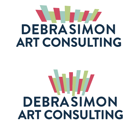
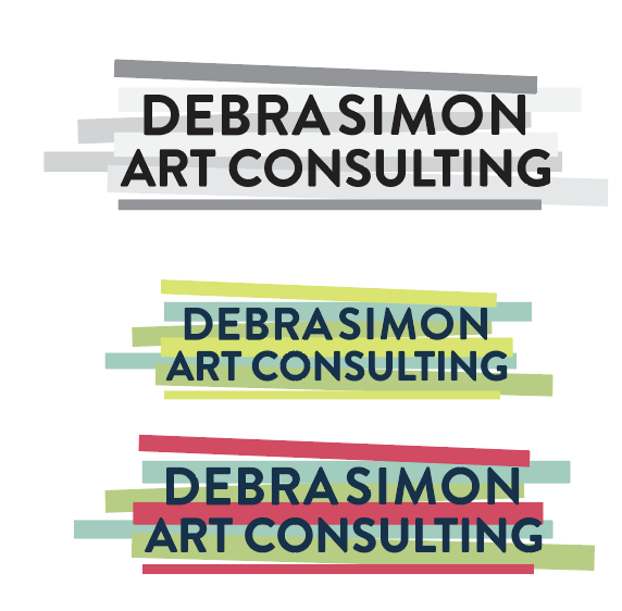
We inched closer towards exactly what she was looking for. Debra loved the variety of color, as well as the grayscale options in the last design above. It had a sense of topsy-tuvry movement, as well as clean lines and an outdoorsy feel harkening towards outdoor public art. This concept morphed into the final branding package presented.


______________________________________________________________________________
NJ Pediatric Dentistry

Logo Mark Concept

Main Logo Choosen

Social Media Elements
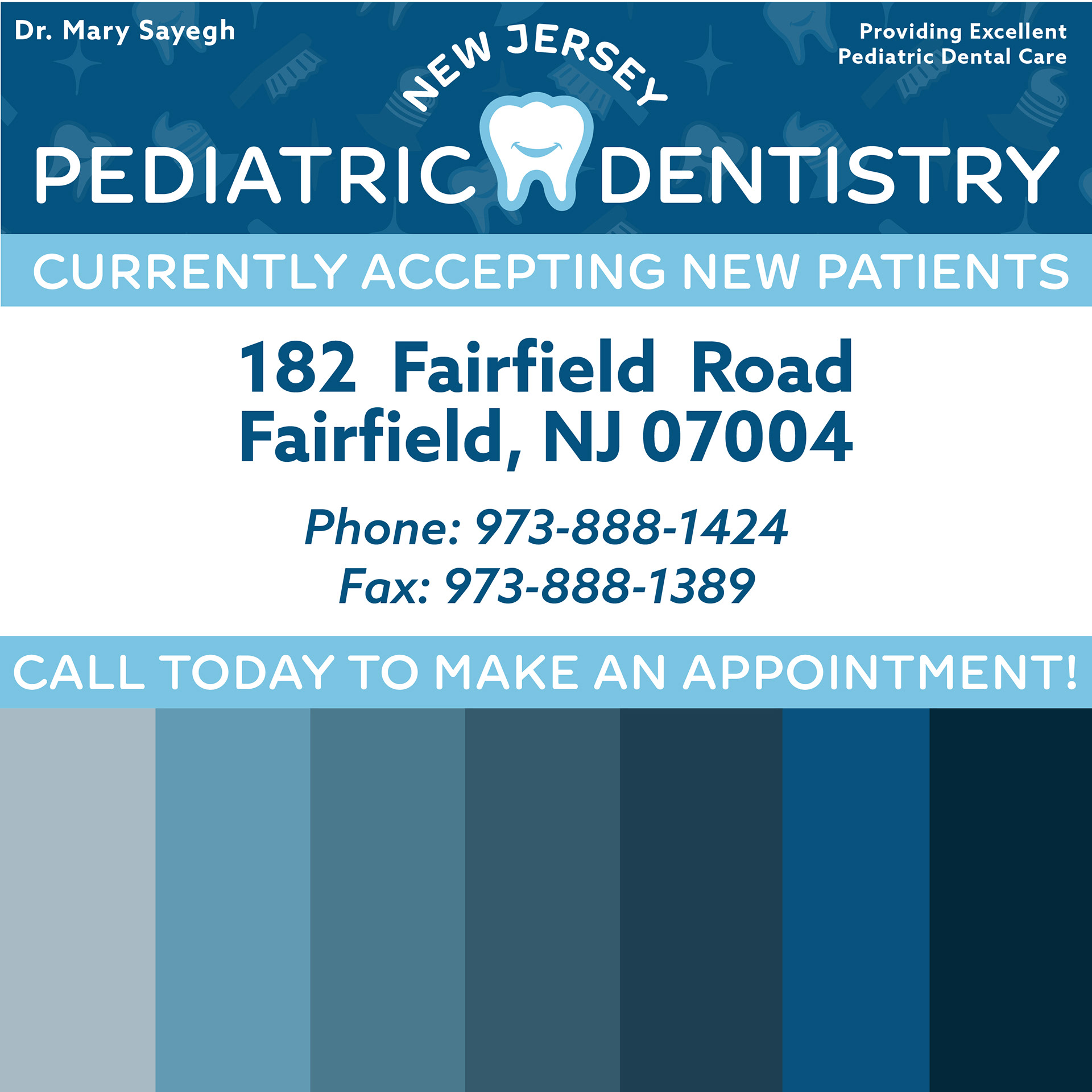
Magazine Ad & Color Palette
Secondary Logo Concept

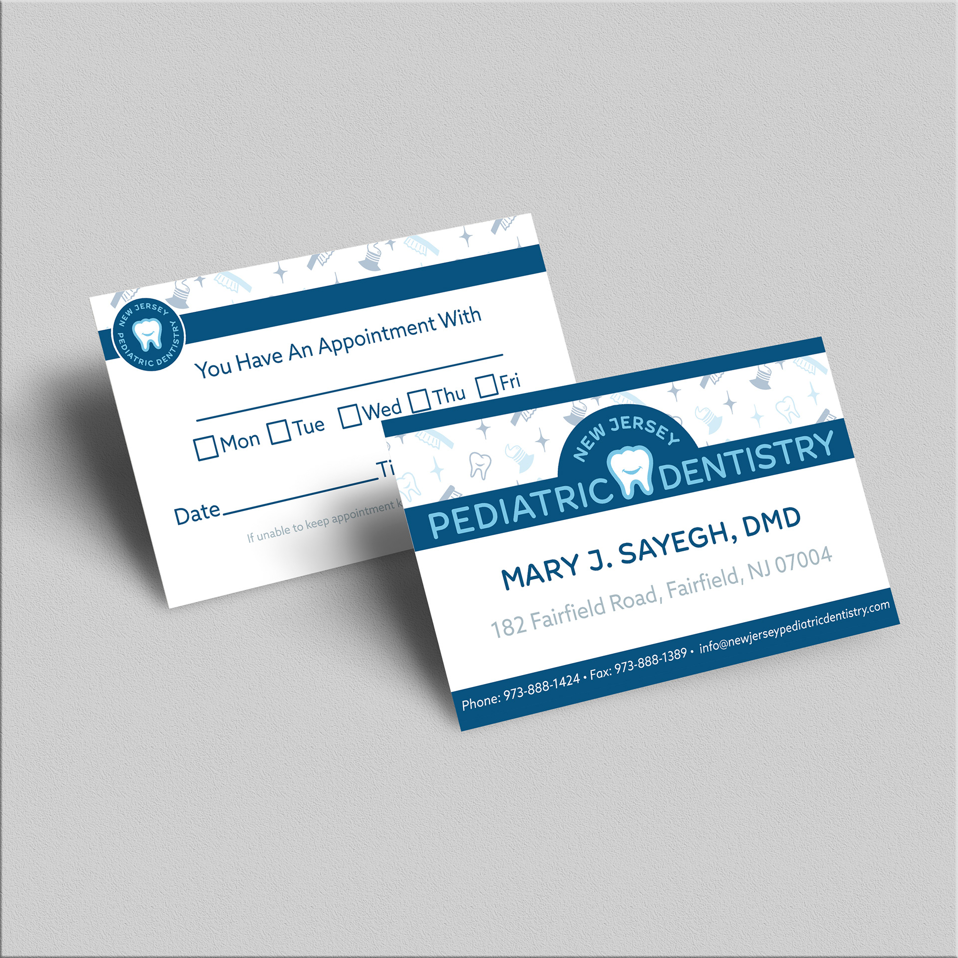
Business Card MockUp <a href="https://www.freepik.com/free-psd/luxury-business-card-mockup-psd-pink-tone-with-front-rear_16769073.htm#query=business%20cards&position=1&from_view=search">Image by rawpixel.com</a> on Freepik

Sticker MockUp <a href="https://www.freepik.com/free-psd/round-shape-sticker-mockup_23571527.htm">Image by Xvect intern</a> on Freepik
______________________________________________________________________________
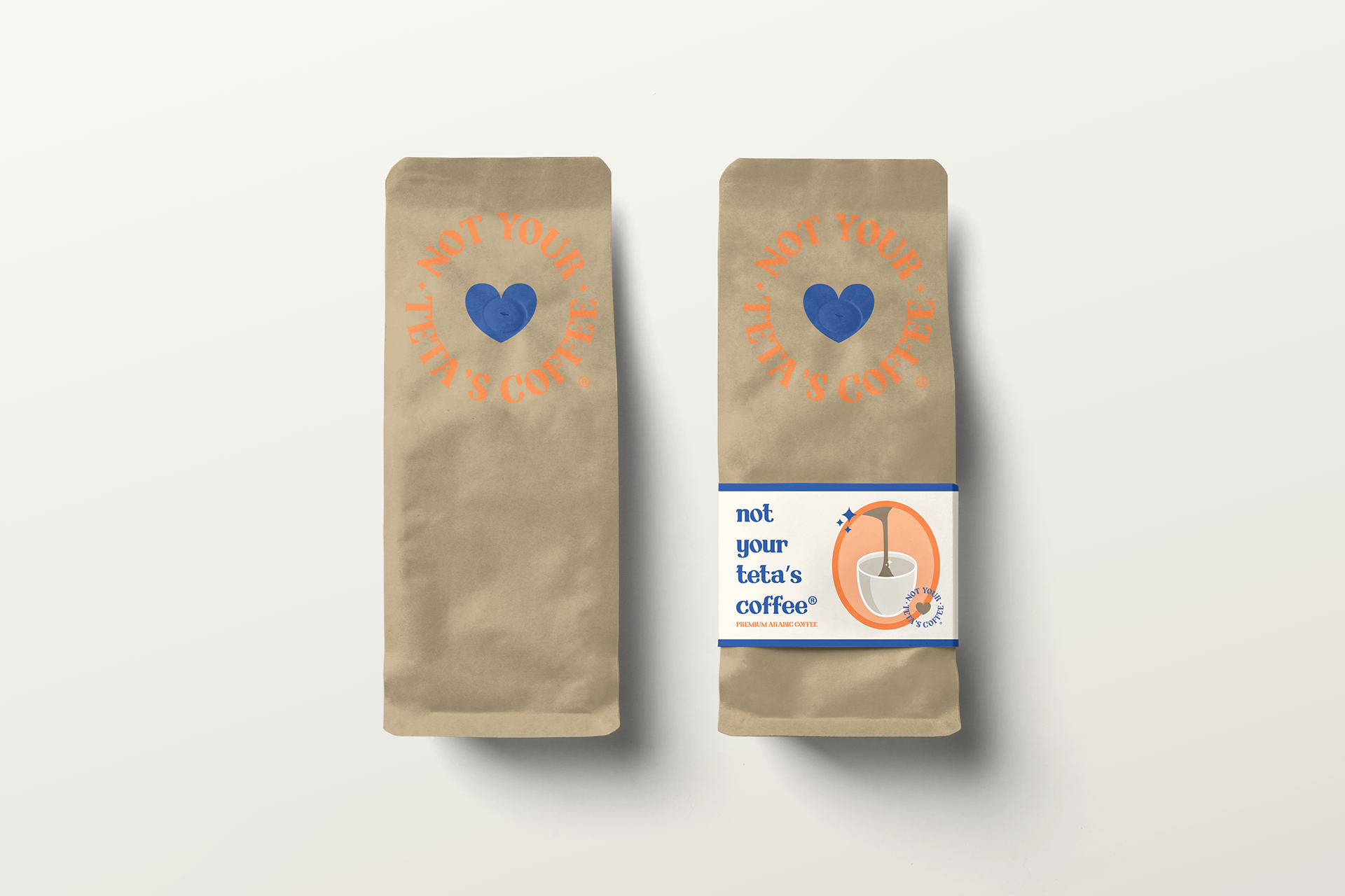
"Not Your Teta's Coffee"
Original Coffee Brand Concept Design


